InfoPost: Mobile App and Website
Timeframe
Feb 2019 - Jan 2020
Teammates
Sarah Ehsan
Raquel Addessi
My Role
Lead UX Designer
Tools
Figma
Illustrator
Photoshop
Intro
Background
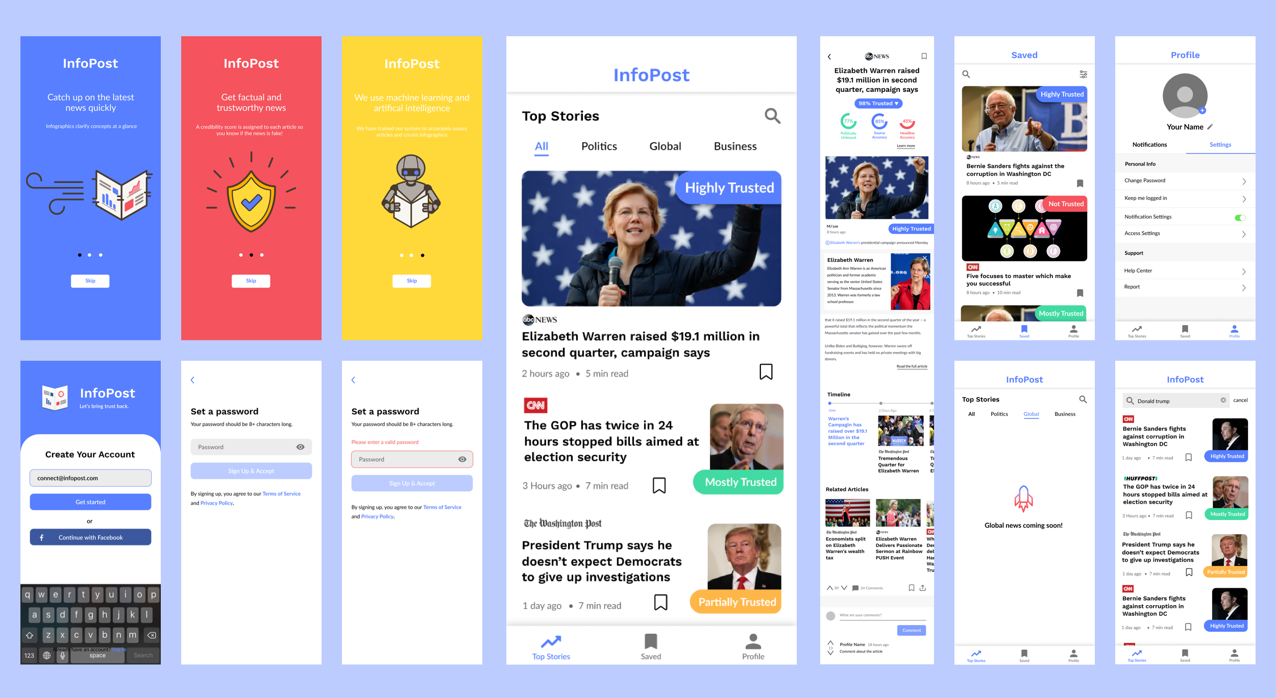
InfoPost is a startup that changes the way people experience the news by giving credibility scores to articles and creating AI generated infographics to increase the clarity and transparency of the news.
Problems
People consume fake news believing it is real.
People don’t trust the media in general anymore.
People must reference multiple sources to affirm facts.
Solutions
Use an unbiased source to pre-determine if an article is trustworthy or not.
Be transparent about how articles are rated.
Generate small infographics for context from outside sources.
App Design
User Testing
We periodically conducted user testing in order to keep our app up to date and to make sure that the users understood how to use different app features and that various features were discoverable.
Article Cards
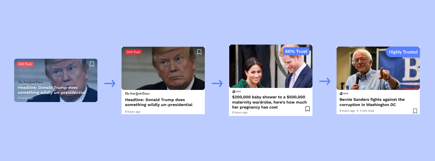
The headings and news site logos did not stand out enough against the background photos, and with longer headlines, would obscure too much of the photo. To fix this, we moved the text-based elements below the photo.
Users had a hard time reading or even noticing the trust score because it was too small. To fix this, we made the trust score larger and moved the bookmark icon so the score was the only element on the photo.
A difference of a few percentage points did not matter to users—what mattered was whether the rating was high in comparison to other article ratings. As a result, we decided to display phrases instead of numbers.
Article card iterations
Expanded Trust Scores
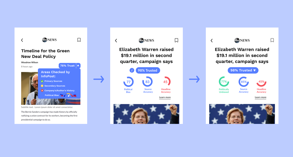
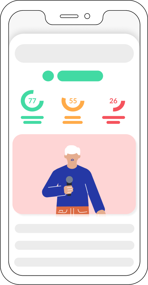
The icons were inconsistent and hard to read on the blue background and the trust score didn’t look very clickable because the design matched the outside cards’ design which wasn’t clickable. To fix this, we moved the score to the middle in order to make it more prominent and added an “i” next to it to represent extra information. We also decided to display percentages with colors and circles for easy understanding.
Some of our users thought the “i” was a separate button and were confused about the context of the numbers in the circles. To amend this, we re-instated the drop down arrow and added the percentage symbol next to the numbers.
Expanded trust score iterations.
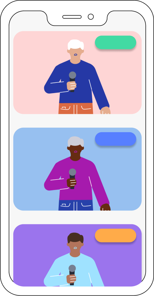
I experimented with different styles of graphics for InfoPost. Here are some examples of work I created with Adobe Illustrator and/or Figma.
